Sash House
Sash House


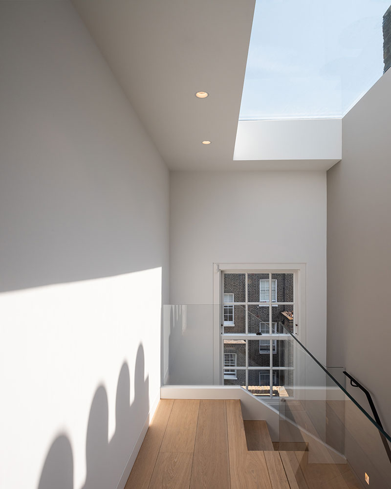
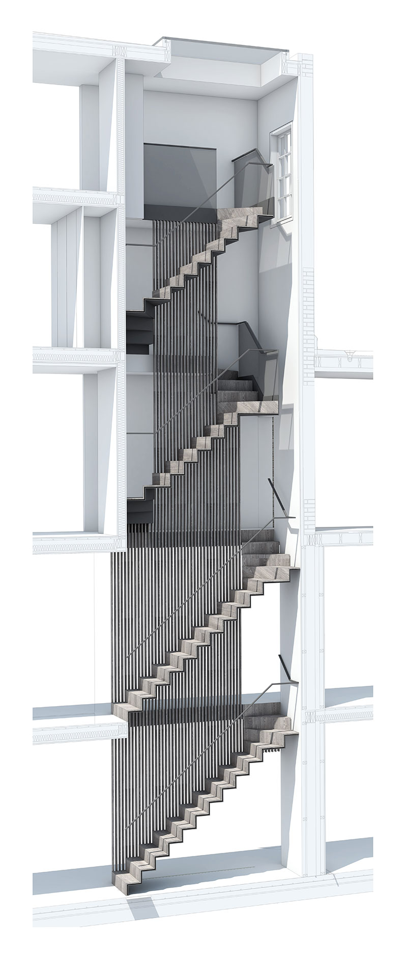
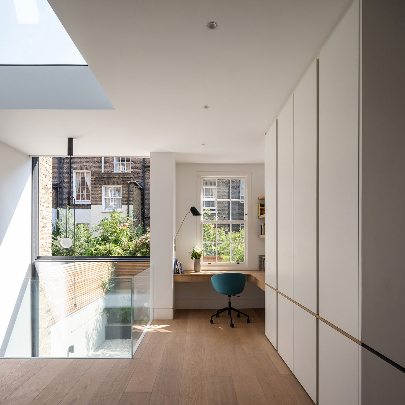
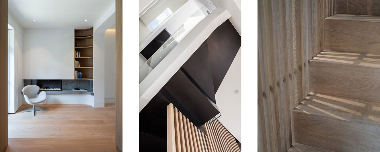
To achieve this, a fundamental reworking of this vertical circulation was necessary to link each floor of this tall 5 storey house. We created a slim folded metal winding staircase that was pulled back from the elevation internally to form a triple height void with a roof light above.
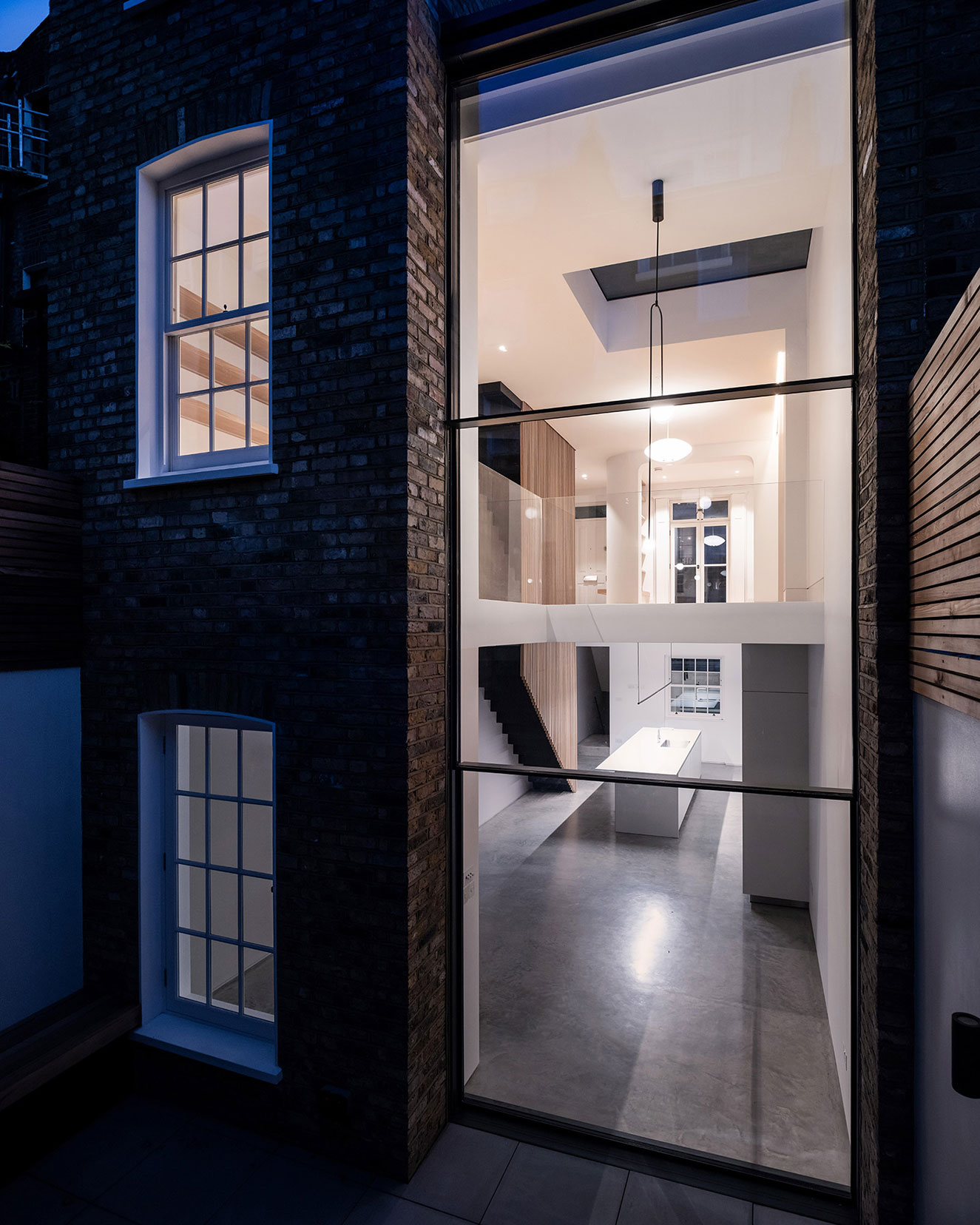
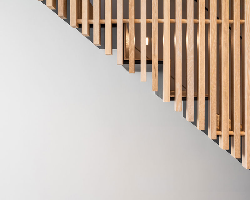
This approach illuminated areas that would typically be deprived of natural light in the deep plan of this house. A series of oak fins act as a screen between the circulation and living areas adding a rich material continuity to all floors. This is further emphasised by a slim metal balustrade that matches the finish of the stair underside.
The strong geometric lines of the folded staircase are clearly read behind the screen and the light is softly diffused through the oak fins on all levels.
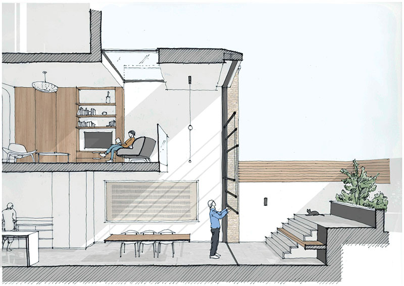
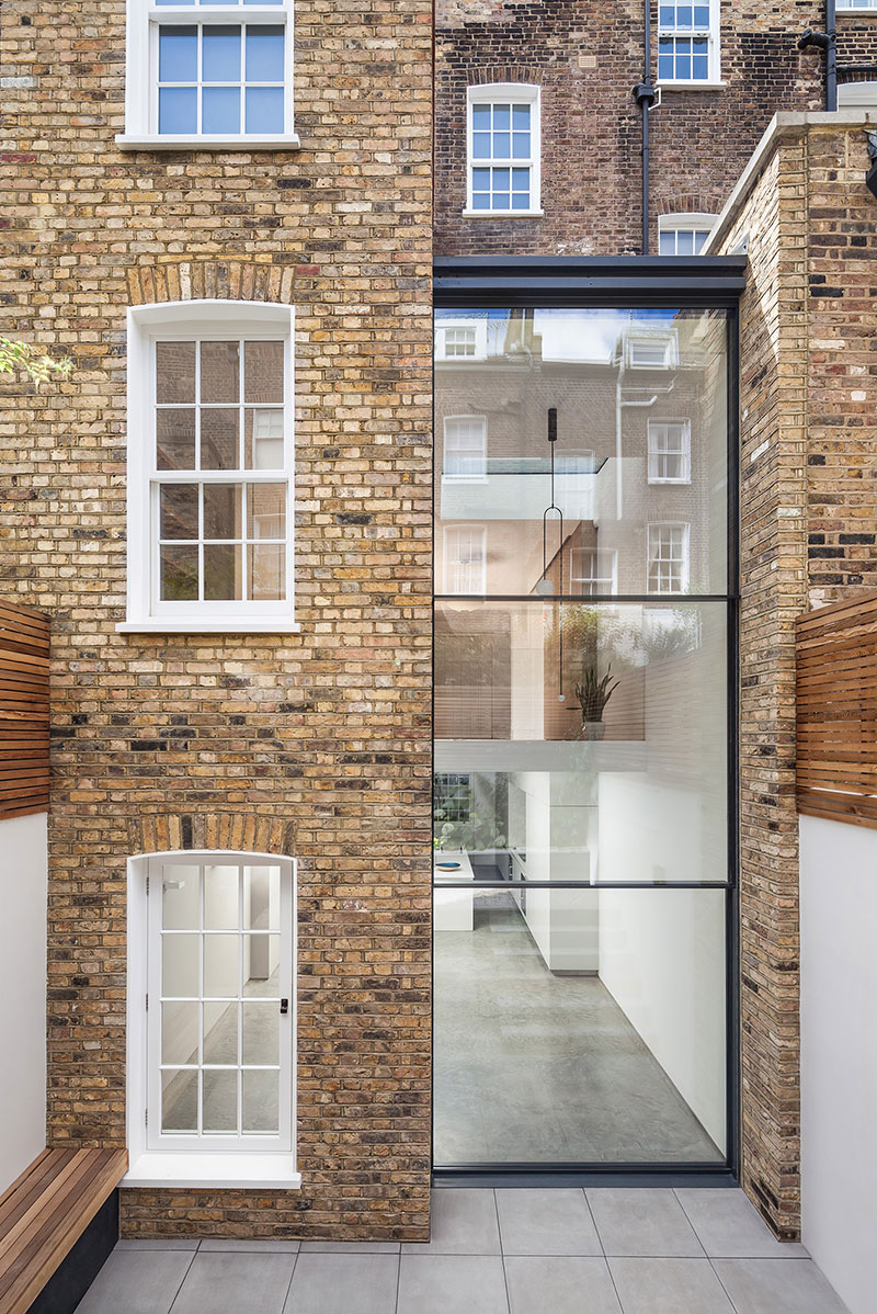
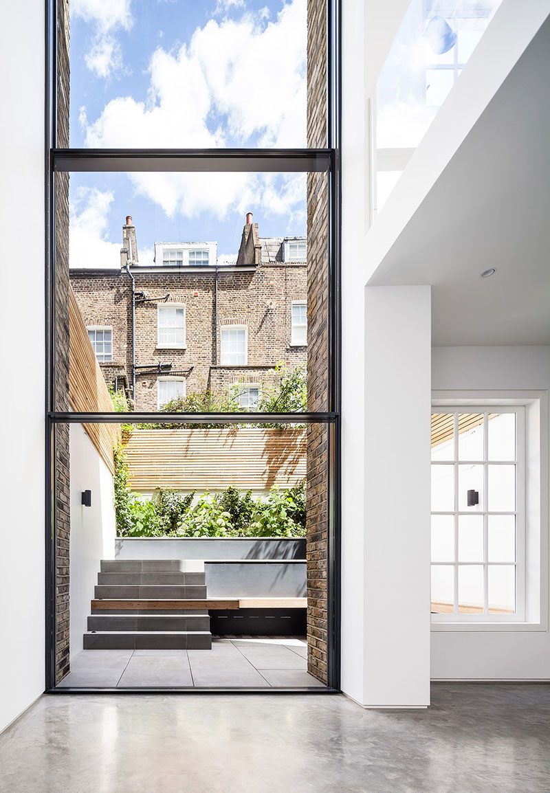
A glazed extension infills the void between the existing and neighbouring closet wings to maximise the ground floor living space and lower ground floor dining areas.
These spaces are linked by means of a double height void with a large counter balanced glazed sash. When the sash is open, the rear yard becomes part of both the dining and living space which is an incredibly efficient use of the space available.
The concept behind this counterbalanced sash window was largely driven by the existing closet wing articulation along the terrace. All existing infill extensions have prominent horizontal transoms so this language had to be read within our design to comply with the planning guidance.
Our proposal is an interpretation of the traditional casement and swing/ pivot doors used on the other properties. When closed this glazed unit clearly reads as horizontal and avoids an over emphasis on the vertical despite its height.
The result was a contemporary and minimal glazed extension that satisfied all the statutory requirements outlined by the planning and conservation officer.
